Architectural Floor Plans
These are the archtitectural floor plans that our first architect came up with. The options are pretty varied. Have a look through and see what you think.
Putting the extra bedrooms downstairs
The first of the architectural floor plans is a modest extension that fulfills the brief and would come in well under our budget.
The concept of the design is to create two symmetrical wings, on one floor either side of the home the same depth as the main part of the house.
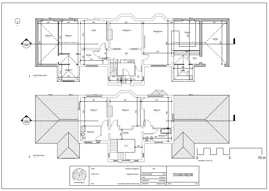 Floor plan with the extra bedrooms downstairs.
This version is drawn with the kitchen on the west side of the house and it could easily be switched the other way around.
The advantage of having the bedrooms downstairs is that if either of our parents ever need to live with us for a while, or indeed if we find ourselves growing old in the house then there are no issues with stairs. Neither ourselves nor our parents are at that stage just yet so accessibility isn’t top of our list.
We decide to look at different options because we feel that since we have the budget available we want to put it to work to make the house larger both up and downstairs as we’ll get more back on resale for a larger home.
Two symmetrical wings with a set back at the back of the house
The second set of architectural floor plans stays with the symmetrical wings concept but extends them up two floors. The depth of the wings is smaller than the main part of the house to allow for an easy to build roofline.
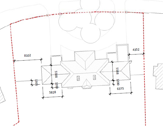
Ground floor
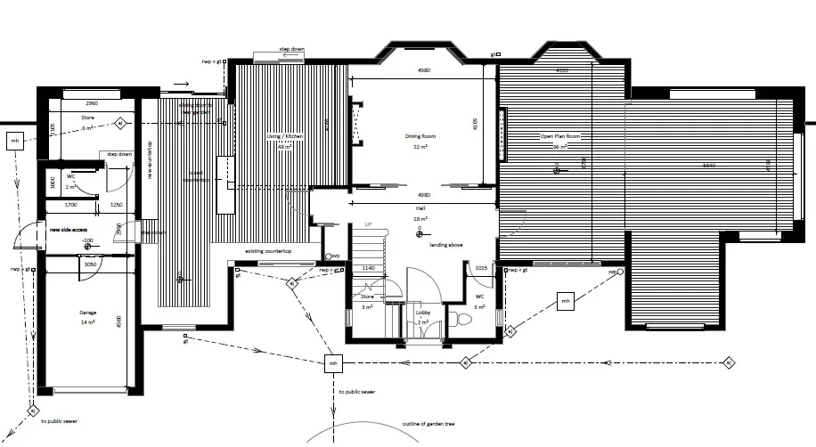
The current garage on the east side remains with space added behind it. I think too much of the original kitchen remains in place in this drawing. I think improvements can be made to the flow of kitchen / living / dining on the east side and I’d love to add a bay window or room that extends into the garden. While keeping the garage in situ seems sensible, it leaves the existing 3m space which I know from the experience of living in it is not wide enough for the kitchen I have in mind.
The pillar in the middle of the space makes things difficult.
There’s also no utility room. How did that get left out of the architectural floor plans?
Moving over to the West side of the house the new wing adds a large space which will make a great games room or teenage hangout. A set of bi-fold doors would separate the space and be closed most of the time and could be opened up for parties.
First floor
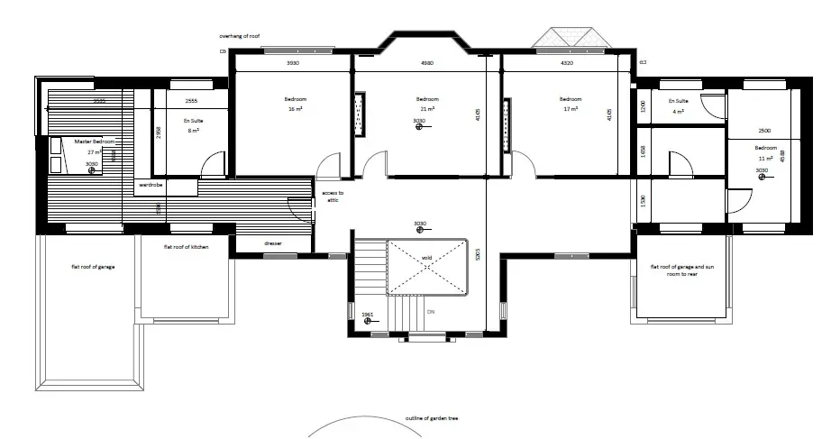
I like the master suite on the second floor. The guest suite has an ensuite bathroom to itself leaving 4 bedrooms being served by the family bathroom. I’d rather that there was a guest suite with two bedrooms and a bathroom. Maybe another bathroom could be added along the northern wall of the house on the west side.
Set forward on East side, set forward to front on west side removed
Ground floor
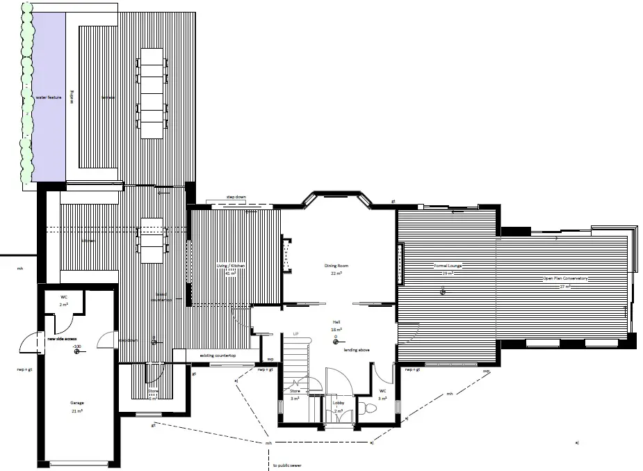
These architectural floor plans get us a bigger space at the back of the house in the kitchen / living dining area. I think it’s a pity that there’s no glass facing the west so while there’s more space the views into the garden aren’t really enhanced and the feeling of being surrounded by the garden isn’t realized in this design.
The central pillar is still annoying me. I wonder if the utility room could be extended forward.
I also wonder about taking down the storage cupboard at the entrance to the east side of the house to create a bit of flow.
Over on the west side the area that would be a study has been removed, probably for budget reasons, but I’d fight to get that back in there. I like the way it looks from the outside as well
First floor
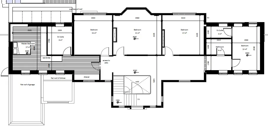
The first floor design is the same as that on the architectural floor plans above.
Set forward on both east and west side
We keep tweaking our architectural floor plans...
In this design the ground floor is set forward of the current building line to the back of the house on both sides.
Ground floor
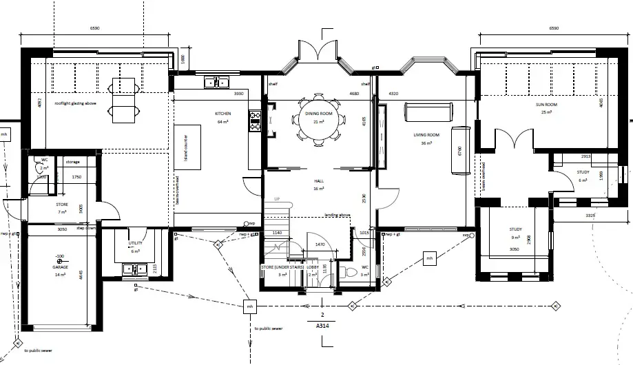
For a change let’s start on the west side of the house. I think the set forward on this side doesn’t serve much purpose. It creates space for a second study but the circulation patterns into the studies and the sunrooms severely compromise the space in the current living room.
Over on the east things are getting better. I like where the kitchen is although I’d adjust the position of the island. I might put a bay window in and maybe make the kitchen eat in. The central pillar is gone and the storage area at the entrance is gone. (hallelujah). I’m still tempted to make the utility room bigger. There’s a bit of wasted space starting to happen. Maybe the entrance lobby could be made a bit bigger. How might a curve and an internal window liven things up? The garage could do with being lengthened. It’s not long enough for a car at the moment.
The line running to the east of the kitchen makes it difficult to use the in-between space. Any furniture arranged in that space would feel a bit at sea.
The living area at the back of the house would be lovely. It would probably be a TV free space with the emphasis on looking out into the garden.
Back to the kitchen layout.
I want to spend a bit of time looking at the difference between the two sides of the house. The stairs mean the entrance to the east side of the house is pushed to thee back of the house. If we look on the west side there is room to move the door towards the front of the house. This would leave a lovely long stretch of units for a kitchen.
First floor
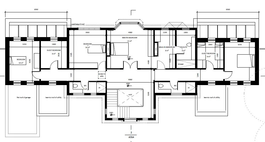
The design changes upstairs to create a master bed, walk-in closet, bathroom sequence out of 2 existing bedrooms. I left the door to the existing bedroom to be able to get out of the closet or bathroom without disturbing the person still in the bedroom too much. My one misgiving about that arrangement is that the closet is pretty small. There wouldn’t be much room for getting dressed. It’s more like a walk-in wardrobe than a dressing room.
The northern corridors are used to create 2 bathrooms. This leaves space for 6 bedrooms, 2 of which are small and there’s no family bathroom with a bath.
The eastern or western bedrooms could be combined with one of the corridor bathrooms. Add an extra door and you’ve got yourself a guest suite.
Set forward on east side, set forward to front on west side included
Ground floor
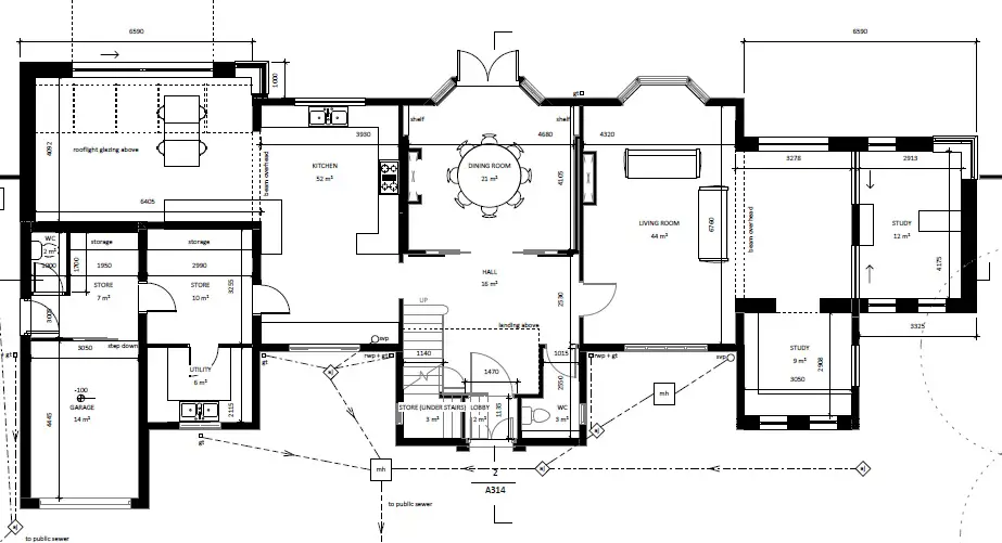
With these architectural floor plans, starting on the east side, some of the wasted space has been reclaimed to make a bigger storage space. I like the idea but I think it would be better on a slightly lesser scale. This design makes the space feel less open and turns the kitchen into a bit of a corridor, although to be fair the main work area remains enough over to the side.
Over to the west the rooms have been reorganized to create two studies and a larger living room with an easily readable shape. If I decide we really need 2 studies I think this is the best arrangement. If not, the games room with a study alcove will be the way forward.
First floor
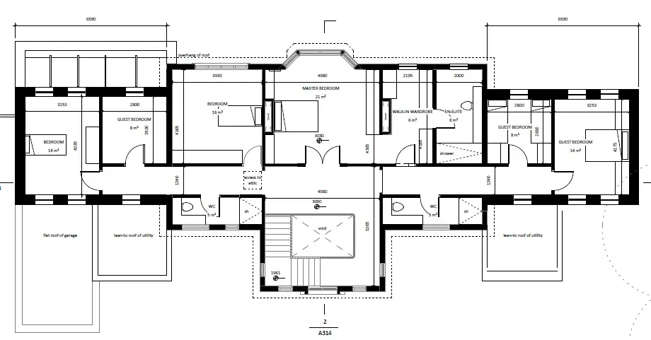
The first floor remains the same as above.
Set forward across back
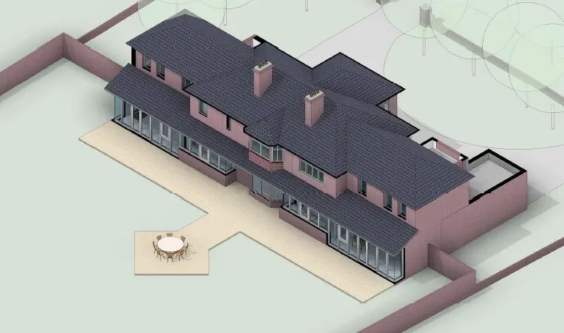
In this concept the set forward has been applied to all the rooms downstairs at the back of the house apart from the central room.
Windows all the way across the back was an aesthetic breakthrough from the back of the house, but didn’t solve many space problems.
Ground floor
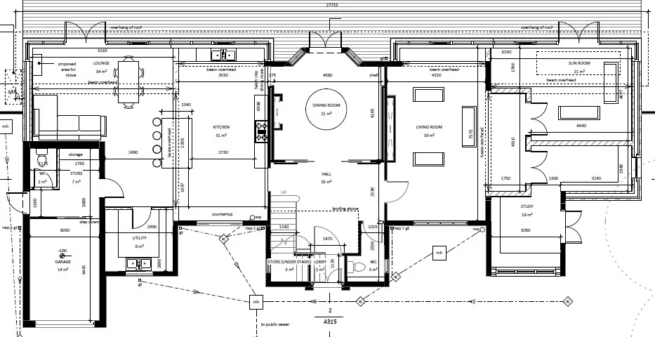
I think this design looks great from the outside and I think it’s driven by aesthetics. Inside I think it makes things more difficult, not to mention all the extra building this would require for very little space gain. Maybe the windows across the façade could be maintained but the set forward kept to the extremities.
My main gripe is that it re-introduces a column into the open plan kitchen / living / dining space
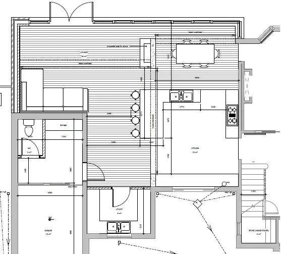
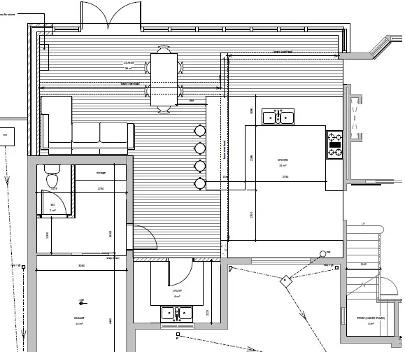
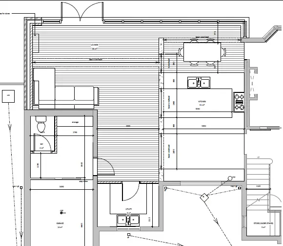
This leads to trying out a whole load of kitchen options.
Over on the west side the new set forward causes less disruption but the living room and sun room are now both a bit of a peculiar shape.
Kitchen options
First floor
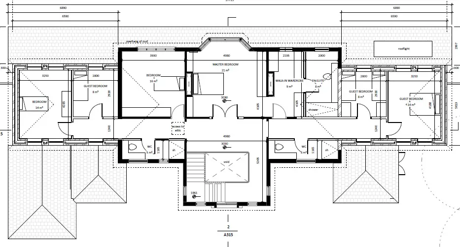
The first floor remains the same as above.
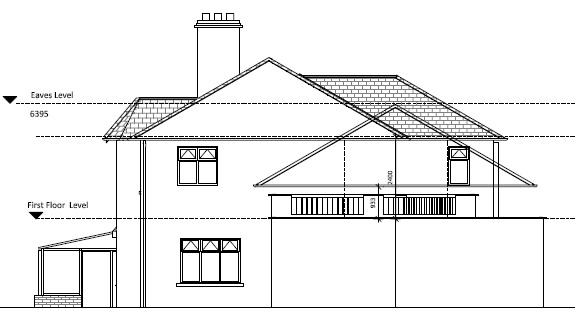
Raising roof on garage to create a room
As an aside in our architectural floor plans process we did a little exercise to see if raising the roof on the garage would yield some interesting space on the east side of the house.
Go or no go with our architectural floor plans?
Just as we were circling the drain on the final design of our architectural floor plans and prepared to seek planning permission (a building permit) we had news that my husband’s job would be changing. So we had to put the breaks on and wait through a period of uncertainty before we knew for sure whether or not we’d be staying in the house or moving on.
More Remodelogs for you...
1 - My Dream House2 - My dream house - First Floor
3 - Dream House Floor Plan Inspiration
5 - Architectural Design Brief
8 - More architectural floor plans (coming soon)
9 - What is a Quantity Surveyor?

