One of those plans is to be more in touch
with you, the House Plans Helper community, via email. So I’ve put together a new format for House Plans Helpers Alerts and I aim to send them out to you once a month.
They’re going to be compact and yet there’ll be so much inside. You never know which home design insights might be useful to you so keep reading throughout the year.
I spend many enjoyable hours collecting together images, quotes, useful tips and knowledge nuggets so I figured why not pass them on to you so that you can enjoy them too.
So here goes. Here’s what inside the new House Plans Helper Alerts…
- What's New
First I’ll quickly update you on any new pages that have been added to the site and anything else that's going on with the site. Some of my pages take a long time to develop so some months there might not be anything new.
While we're here, here's what's new at House Plans Helper since my last
update.
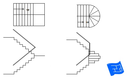
Staircase Design
Your staircase design is a great opportunity to add that certain something to your home design. Find out how.
Continue reading "Staircase Design"
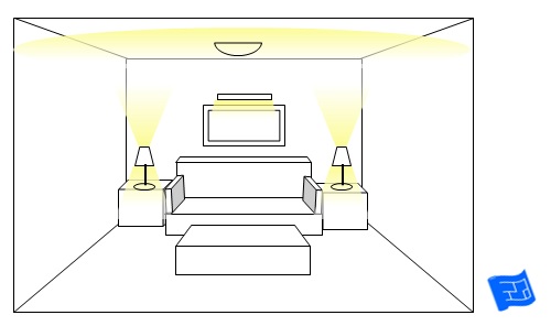
Living Room Lighting Ideas
Choose from this selection of living room lighting ideas to put together a relaxed living room lighting scheme.
Continue reading "Living Room Lighting Ideas"
Design a closet
All the mysteries of how to design a closet - solved.
Continue reading "Design a
closet"
- Tips from an Architect
Architects spend their careers thinking and practicing building design. I’ve collected together a few tips from architects in the hope that we might all learn from their wisdom.
The January Tip...
Our experience of an architectural space is strongly influenced by how we arrive in it. – A tall, bright space will feel taller and brighter if entered via a low-ceilinged, softly lit space. A room with south facing windows will create more of an impression after passing through a series of north facing spaces. Read more about entry design.
- All Star Homes
Every once in
a while as I’m browsing through all my favourite architecture and design sources, I come across an example of residential architecture that challenges my assumptions about home design. Sometimes it’s use of space, sometimes it’s shape of space, maybe it’s the form of the building, or the way the architect has responded to the site.
If you come across any home, from anywhere in the world that you feel really pushes boundaries architecturally I’d love to hear from you about it. Just reply to this email.
Here's the 'All Star' home for January.
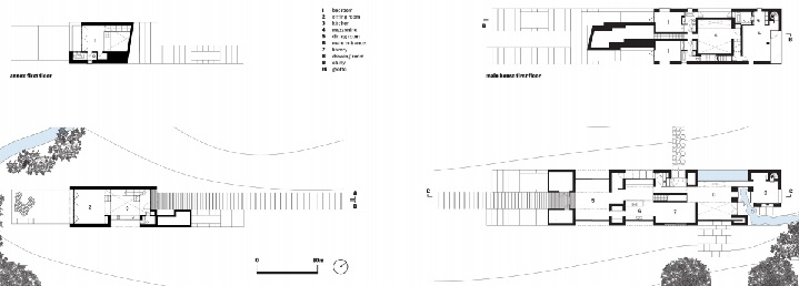
Flint House
I find this home by Skene Catling de la Pena remarkable because of its unusual wedge shape and the decoration that
has been applied to the exterior. And I'm not alone. This house has been awarded the RIBA House of the Year 2015.
The shape of the home creates some really interesting outdoor spaces inserted part way up the wedge.
The exterior of the home is flint where the stones have been selected depending on their coloring, starting dark at the bottom and getting lighter until they are topped by chalk.
You can see more pictures over at Skene Catling de la Pena.
View the floor plans
- Home Design Nuggets
The HPH design workshop
helps you to identify ways in which your home design can contain nuggets of pure gold design genius. Here are a few to give you a taste of what the home design workshop is all about.
Here's January's Design Nugget.
Make sure your home includes a space that I like to call the center of gravity. It’s a surface where, during the morning routine, everyone can collect together the stuff that they need to take with them for their day so that no-one forgets everything.
- Interior Design Decoded
In this section we take a look at an interior photo and discuss the design under the decoration, which is to say we focus on the architectural design elements rather than the color of the wallpaper.
So what are we decoding for January?
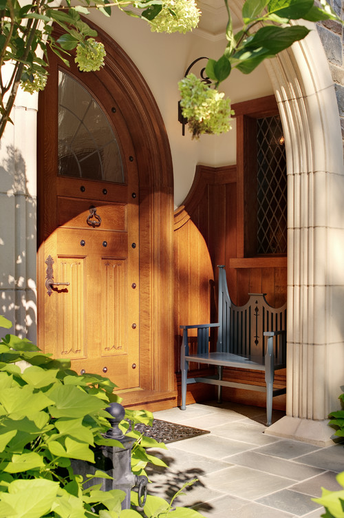
OK - So first or all I appear to have picked a photo of the exterior of a house but it
fits with the philosophy of this section.
There's some really well thought out design going on in this entrance. First of all, I love the way it's sheltered. I love the way the paneling to the right of the door has a curve at the top to blend with the curve of the door. It wouldn't be the same if the top of the paneling was straight. I love the fact there's room for a seat. There's windows in the door to allow the light through and I assume there's a light in the porch for when it's dark up there off the top of the photo. The only thing I might have included is a dip in the stone so that the mat could sit flush to the stone surface.
- Quote Me Happy
I choose a short architecture quote that reminds us of the House Plans Helper philosophy.
Here's the quote for January...
Architecture is the thoughtful making of space. Louis Kahn
This is speaking to the fact that when we plan and build a home we tend to think in terms of walls and doors. Don't forget to really imagine how the space will feel like to be in and to use when you're making your house plans.


