| Back to Back Issues Page |
 |
|
Home Design Coffee Break May 01, 2016 |
| Hi Everyone, Where do home design ideas come from? As you can imagine, I always have my eyes open for home design ideas. I might be in a shopping mall or a hotel and I'll come across something that I think would work really well at home. For example, take hotel bathrooms where there's often a pull out drying cord. One of these... 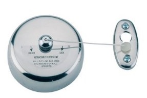
This could be put to so may uses at home where you might want to dry stuff - the bathroom, the laundry, the garage. Have you stumbled upon something in an unusual place that you've put to use as part of your home design?
This is what I've been looking at this month of May...

Symmetry isn’t the only form of balance – Balance is inherent in a symmetrical composition, but asymmetrical homes can be either balanced or unbalanced. Consequently, asymmetry tends to require a more complex and sophisticated understanding of balance.

Kendram Turf House
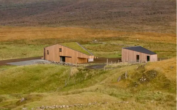
The design genius of this home by Rural Design Architects Is a great example of design on a modest budget. Here the architect incorporated the spaces required (a bedroom, a kitchen and a living room) while reducing the amount of square footage and the materials required to build the home by changing the shape from the standard rectangle to a lozenge shape. This renders the interior shapes more interesting while remaining fully functional. The smaller building is an art studio. 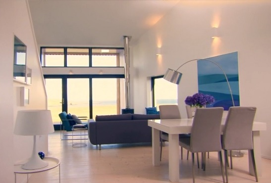
The living room enjoys a high sloping ceiling and the bedroom is nestled into the sloping ceiling on the second floor on the other side. It must feel really cosy up there. Here are the floor plans. 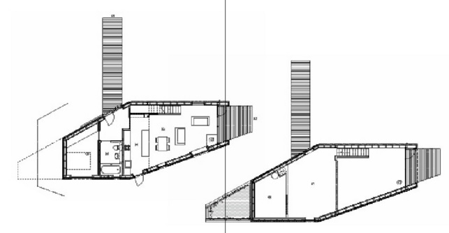
The turf roof really makes this building blend into its environment. 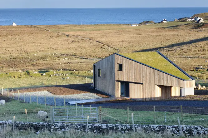

I think all of us can identify with the cleansing feeling of getting rid of old stuff that’s cluttering up our cupboards. It’s weird how the mind can feel so much clearer when we get rid of stuff we no longer use, and keeping your possessions lean is essential in a smaller home. One of the fears of de-cluttering is that the item will be needed the moment it has gone. I've got around this problem by setting aside a space for a de-cluttering holding area where items that are ready to be thrown out sit until I'm really sure I don't want them. If the item lies unused in the holding area for a long time, it really is time for it to go.

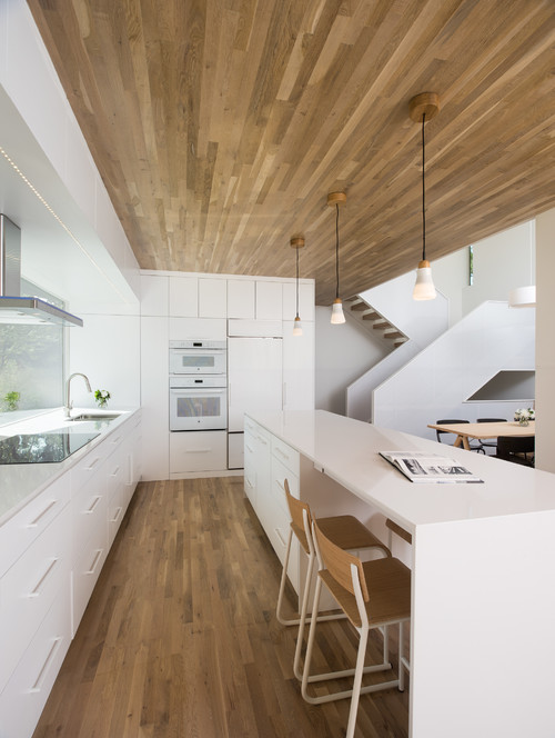
Let's deconstruct this kitchen from a design standpoint. It has some similarities to the kitchen in the Kendram Turf House we've been looking at in that the ceiling height is lower than that of the surrounding space. This creates a cocooning effect which is accentuated by the use of wood on both the floor and ceiling. The backsplash has a view to the outside by the looks of things. I like the little row of lighting that runs across the boxed ceiling above the extractor.
"Always design a thing by considering its next larger context - a chair in a room, a room in a house, a house in an environment, an environment in a city plan." Eliel Saarinen I think this quote speaks to making sure everything works together. It seems to me though that home design works the other way round, starting with the city (or countryside) where the home is to be built and working down to the chair. Is that the case Eliel?
I hope you enjoyed this month's home design coffee break. I'll be back again in June. I'll be featuring a three level 'tiny home'. Until then...  House Plans Helper is powered by SBI |
| Back to Back Issues Page |
