- Home
- Floor Plan Analysis
- Home Floor Plan Designs
Home Floor Plan Designs
General Layout
This page is all about analyzing home floor plan designs with a focus on the general layout of the home.
I've broken it down into three parts: organization, shape and light.
Be sure to take a look at how floor plans should work with the outdoor surroundings, and take a room by room walk-through of your floor plan.
Organization
Circulation - Moving Around in Home Floor Plan Designs
Imagine you are walking through the home floor plan design. Check to see that you can move freely between spaces and between levels without meeting any obstructions like furniture or awkward door swings. It’s a good idea to draw circulation lines onto the floor plan.
Take some time to examine the main staircase and landing spaces in your floor plan. What spaces do the stairs leave and arrive at? Imagine what it will be like to go up and down the stairs. Is the stairwell narrow and dark or light and spacious? If you’re thinking about moving the stairs remember that they need to be in the same place on the plan for the two levels they are serving.
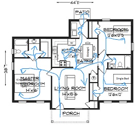 Floor plan with circulation marked
Notice how much of the space in the living room is taken up with circulation. There isn't enough room to get round the dining table.
Space Organization in Home Floor Plan Designs
This section looks at the way the rooms or spaces in the home are connected to each other in home floor plan designs and takes a high level look at how each space is organised. First of all check that each space really is a space of its own and isn’t just swimming on the floor plan or in the middle of a circulation path.
Check for...
- Living spaces that are grouped together in the public area of the home. Typically on the same level as the entrance in a multi-story home or grouped together in a single story home. Look for living spaces that take advantage of the best view that the house can offer AND if possible (it’s getting to be a tall order here) be sunny or shaded depending on what you want.
- Private spaces such as bedrooms that are grouped together and located in a more private area of the home.
- Missing spaces. If you really want a particular space like a study or office space or a big mud room perhaps a bit of tweaking on the plan will give you the space that you need.
- Extra spaces that you probably won’t use. If you can afford to build them and heat or cool them then that’s fine but if not think about modifying the plan to remove these spaces, or maybe move onto the next home plan. Sometimes there is a ‘flex’ or ‘bonus’ space. If you know what you will use the space for, go ahead and change the label and think about if the space is appropriately located for the use you’ve got in mind. A gym next to the dining room might not be ideal.
This downstairs floor plan is grouped into family or informal living spaces and more formal spaces. The outdoor living space is shared between the two. The den could be used as another living room or perhaps a study.
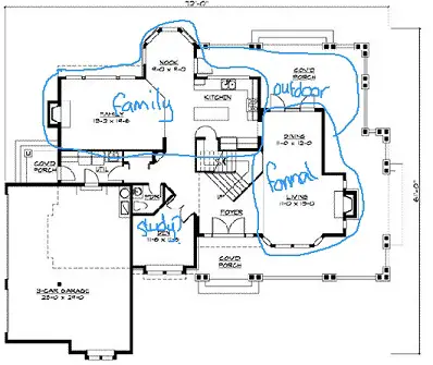 Floor plan with room groupings marked
Fireplaces
If there is a fireplace make sure you’re happy that the furniture can be arranged to take advantage of it (especially if the fireplace is in the corner). Remember that if the fireplace requires a chimney then the position of the fireplace can’t be moved without reorganizing the space on all the levels that the chimney passes through.
Storage in Home Floor Plan Designs
Take a look at the storage included in the home. Look for built in closets and book shelves and other closets and presses. Check to see how the space under the stairs is being used. If there is a lack of built in storage space is there room to add furniture for storage? The importance of storage can’t be understated – an organized home is a happy home!
Shape
Room Shape and Proportions in Home Floor Plan Designs
The minimum dimensions allowed for a habitable room (doesn’t include bathrooms or walk in closets) is 7ft / 2m. That’s about the size of a king size bed. It might just about do for a single bedroom where the only thing going on is sleeping but it’s still a very small space to spend much waking time in. Just to put some perspective on it, a jail cell is about 6ft x 8ft.
Think about where you currently live and the dimensions of the rooms you live in. Measure them and measure their height. For each of the rooms do you wish they were bigger, smaller, a more interesting shape or the ceiling higher or lower? See how the floor plan you are considering stacks up against what you think about your current living space.
Sometimes there might be architectural details like dropped ceilings, columns or pillars or changes in level that help give a feeling of separate spaces even in an open plan.
See how the pillars in the left hand drawing divide the space from the corridor and the room to the left. The definition of space for the kitchen in the picture on the right is helped by the dropped ceiling.
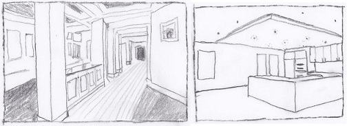 Architectural Details Sketches
So how do columns and pillars show up on a home floor plan design?
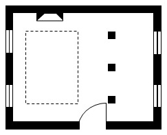 Columns and a dropped ceiling shown on a floor plan
In this room the right hand side of the room is made into an alcove using the columns and left hand side area is defined by an architectural detail in the ceiling with the fireplace acting as focal point.
Angles
In some house plans you’ll come across doorways or walls at 45 degrees to the outside of the house. When you find these angles just check to see if they’re helping the design. Imagine the home plan without the 45 degree angles and see if it would be better.
Have a look at this hall. The cloak room and coat closet have doors that are at a 45 degree angle. In this case it adds to the space as it gives the entry more space without compromising the function of the wc or closet.
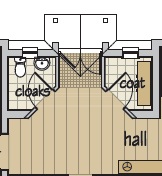 Hall with angles
Here's a segment from a home full of 45 degree angles. It is difficult to think of a furniture arrangement that would work around the fireplace, angled walls and doors. The design of the kitchen is also compromised by the angles.
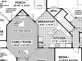 Home with angles
Light
Light in Home Floor Plan Designs
If possible it’s great to have light coming in from two sides of each room. It makes things brighter and avoids dark shadows and/or glare. Think about what the views out of the windows will be and think about how best the furniture can be arranged taking the windows into account. If you don’t like the position of a window think about the impact of any change in position on the exterior appearance of the home. For some home styles the symmetrical arrangement of the windows is fundamental to the design.
See if there are any skylights on the plan or places where light flows between floors. A skylight lets in 30 – 50% more light than a vertical window of the same a size so light coming in from the sky can really make a difference. Sometimes windows above eye level (called clerestories) are used to bring more light into a room. They’re good for light coming in from a second side where the view is ugly or if the room needs to be private on that side.
The image on the left shows how the windows high above the headboard above the bed and above the window going up into the roof line add more light into the room. On the right is another house where the clerestory windows would bring in lots of light.
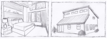 Examples of clerstory windows
More on floor plan analysis...
Here's some more pages on floor plan analysis.
The floor plan symbols page may also be helpful.

