- Home
- Living Room Design
- Living Room Designs
Living Room Designs
Living Room Shapes and Details
This living room designs page gets down to the bones of living rooms designs - talking about living room shape, where to put the doors and windows and finally, architectural elements. You might enjoy the other pages on living rooms to help with your design.
Living Room Shape
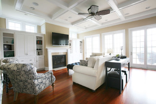
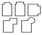
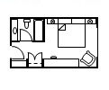
Most of us have living rooms that are mainly a rectangular shape. Perhaps you're lucky enough to have a room that's got a little extra something in the shape. With living room designs there’s lots of potential for adding a bit of magic to your living room layout.
Does a bit of extra space for a piano or to sit and look at a beautiful view appeal to you?
Living Room Nooks and Cozy Places
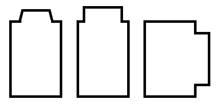
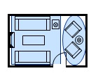
Just like the breakfast nook in the kitchen, a cozy nook in the living room for reading or looking at the view can add a great deal of pleasure to the room for just a few extra square feet. This nook could be in the form of a bay window, a built-out corner or a section separated by pillars or a sofa table.
I pulled together a few pictures to demonstrate...
Where's the best place for the living room door?
Just one door
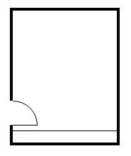
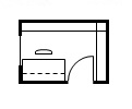
I think a living room door works best if the door is set into the room slightly at least to allow for some shallow shelving or a desk. If the door is placed right into the corner of the room hampers the design because anything put on the wall perpendicular to the door will stick out.
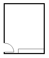 Door against the wall limits the use of the wall. This is mitigated slightly by making sure the door swing swings into the shelf.
Doors, fireplaces and symmetry
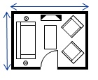
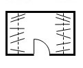
As well as the seating and other activity areas in living room designs, the doors and circulation have to be taken into account. Typically a living room door is a minimum of 3ft (0.9m) which is also the width required for a circulation path. The door placement and circulation can have an effect on the symmetry of the room - especially if there is a fireplace.
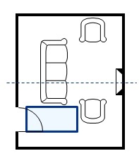
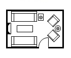
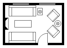
Here the furniture arrangement has been thrown off center. There are two ways of fixing this shown below.
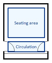
The door in this floor plan has an impact on the symmetry of the room when the furniture is put in place. There are two options. In the floor plan on the right the furniture ignores the impact of the door. There is plenty of seating but the entry to the room may feel a bit cramped. On the right the furniture is adjusted to take the door into account. This means that there is slightly less seating capacity and the circulation space is less crowded.
Several doors
If there are several doors in the living room it's important that the circulation paths do not conflict with the furniture layout. The best way to achieve this is for the two doors to create a circulation path along one wall of the room. The doors need not necessarily be opposite each other - they can be brought together into a corner as long as the door swings aren't in conflict with each other.
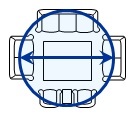
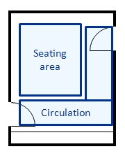 2 doors in an inefficient design. There is less room for seating and anyone in the seating are more likely to be distracted by someone walking through the room.
Living Room Windows
If there is a good view to the outside, then the windows in the living room should take full advantage of this. If you’re in the design process make sure the window sill is low enough so that you can see the view when sitting down.
Living Room Architectural Elements
Architectural elements which can add to the wow factor in your living room design ideas are:
- Wall detailing such as paneling, dado, or picture rails. If you are faced with a room that feels too high adding picture and dado rails can help the room to ‘read’ less high.
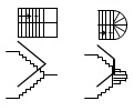
Check out these delightful sketches from the Manual of Homemaking.
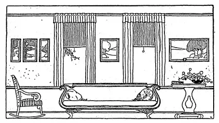
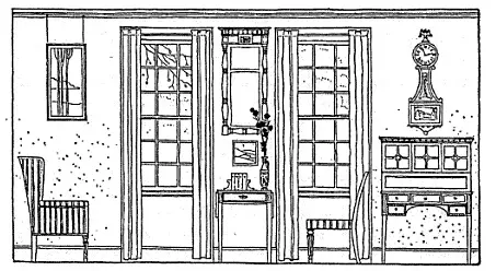
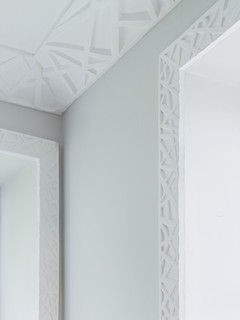
If you have any budget for fancy coving or ceiling details such as light roses the living room is the place to splash out on these. Ditto for window and door architraves


