- Home
- Window Design
- Window Reveal
Window Reveal Design
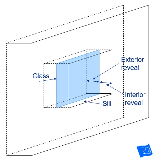
The window reveal is the area surrounding your windows on both the interior and the exterior walls. It's the area perpendicular to the windows, the area of the cut in the wall if you like.
They often don't get much consideration and yet they form an important part of your overall window design.
Window reveal design style
Your window reveal design style depends on a number of factors:
The depth of your walls
Deeper walls means there's more wall area for reveals.
The position of the glazing within the depth of the wall
The glazing can be placed in any position in the wall - more towards the inside or more towards the outside.
The interior and exterior angles of the reveal
There's a section on this below.
The materials used
Wood, plaster, metal - there are probably others
The style of your home
Traditional homes tend to have more elaborate reveals and architraves whereas contemporary homes will have more streamlined window reveal design.
Local preferences
If you have a look around near where you live, you'll soon see what the local preferences for window reveal style are.
These points are discussed or illustrated further below....
Window reveal design ideas
Here's a few window reveal design ideas - some for the interior and some for the exterior.
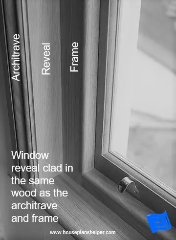
Window reveal clad in wood
If your windows have a wooden architrave it makes sense to clad the reveal in wood as well. This creates a continuity of materials from the frame, through the reveal and onto the architrave / sill.
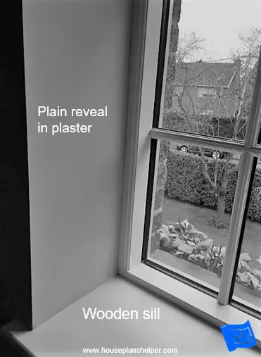
Plaster window reveal
A streamline style in plaster with a wooden sill is another option.
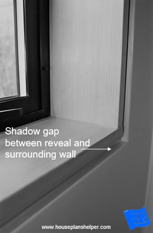
Window reveal with a shadow gap
I like this detail where a shadow gap detail has been created between the window reveal and the surrounding wall.
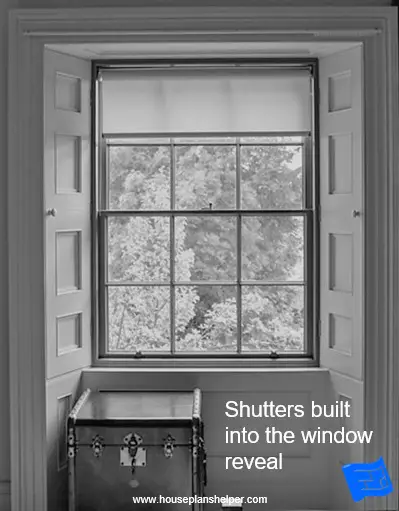
Build shutters into the window reveal
In the Georgian era when houses had thick walls, shutters were built into the window reveal. You can see the wooden knobs which when pulled, pull the shutters out from the reveal.
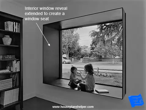
Create a window seat
With a deep wall, a window seat can be created. But if your wall isn't very deep, a window seat is possible by extending the reveal. I think this reveal is constructed from steel.
See more bay window designs.
Vary position of glazing
Different effects can be created by varying the position of glazing within the depth of the wall.
The two windows in this room have been treated differently. The glazing in the window on the right is flush with the plane of the internal wall. In contrast, the glazing in the window on the left is flush with the plane of the exterior wall creating a window seat. This leads to different materials being visible in the reveal (brick and wood respectively).
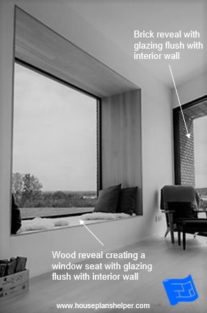 Varying glazing depth creates one window with a window seat with wooden reveal and one window with brick reveal
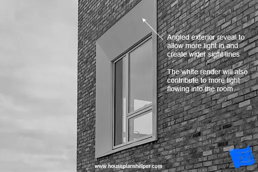
Widen the angle of the exterior reveal
The wide angle of this exterior window reveal design will mean that more light comes through the window. It also allows for wider sight lines.
The fact that it is finished in white will also contribute to more light flowing into the room.
Notice how the exterior reveal of this window is different on one side to the other, possibly to allow more light in at sunrise from the east and shade from the western light at sunset.
Or it might be to take advantage of a view in the direction of the slanted reveal.
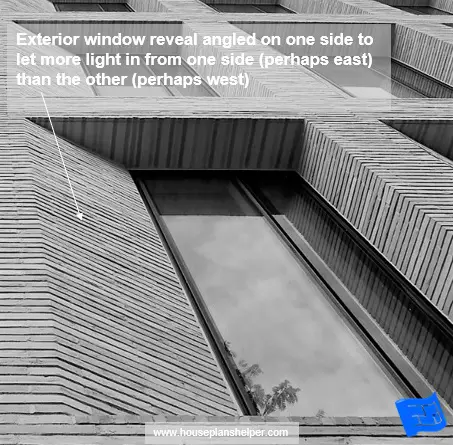 The angled exterior on this window may well be to allow for increased morning light from the east while creating shade from the west light at sun set
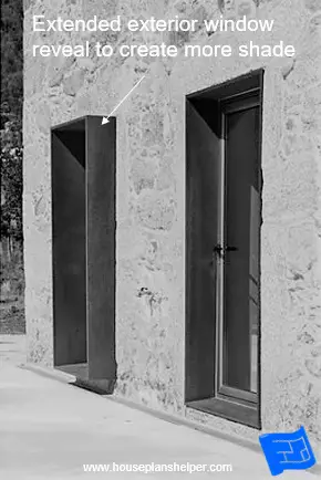
Extending the exterior reveal
Here the exterior window reveal is extended beyond the exterior wall. This creates more shade and will also reduce sight lines.
Extending the exterior reveal at an angle
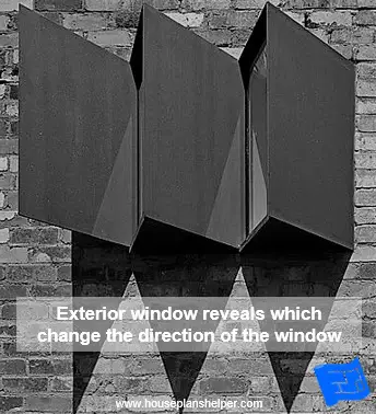
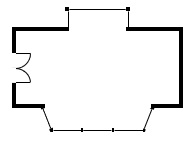
In this example, the exterior window reveals change the direction of the window, perhaps to capture more light, or more likely to move the gaze of those inside the room towards a good view (or away from an ugly one).
I guess these could also be considered as a bay window design.
Angle of window reveals
The angle of a window reveal is an important aspect of the design:
- It makes a difference to the how the light behaves in the area surrounding the window frame.
- It makes a difference to the sight lines or the view through the window.
The deeper your walls, the more impact the angle of the reveal will have. In modern homes where the walls tend to be less wide
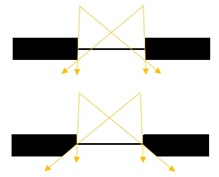
Splayed or angled window reveals change the light / view from the window in three ways:
- The angle of the reveal allows more light to enter rather than the rays at the edge of the window being blocked by a rectangular reveal.
- Wider reveals also mean wider sight lines out of the window.
- Angled reveals prevent glare. On the left the reveal cannot diffuse or reflect any light and the stark contrast between the light outside and inside the room creates glare. On the right the reveal diffuses and reflects the light. The reveal creates a sort of bridge between the light levels outside and inside the room and so the glare is much reduced.
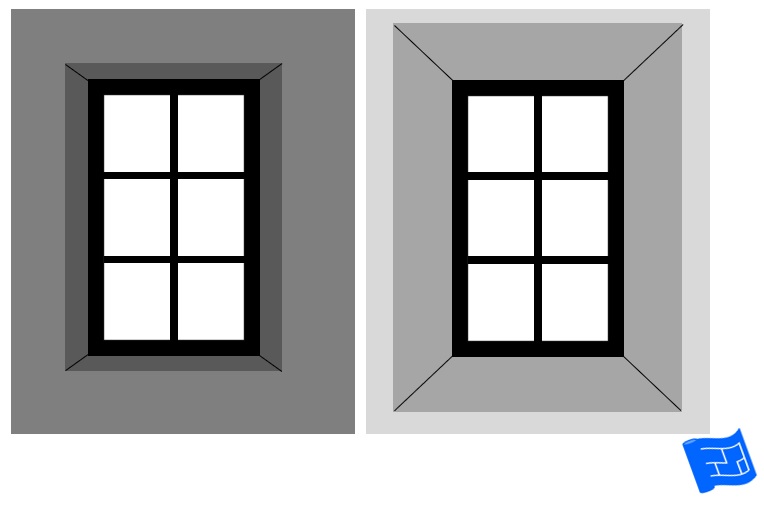 The window on the left has a straight reveal and creates glare. The flared reveal surrounding the window on the right reflects the light and prevents the glare.
Usually the bottom of the window remains flat to form a horizontal window sill. If windows are high in the walls, angling the window sill down will allow more light to enter.
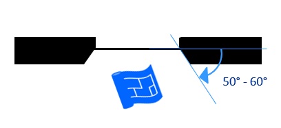
The ideal angle for a reveal is 50 to 60 degrees to the plane of the window.

Which reveal angle do you prefer?
Try out this widget to see how different reveal angles look. The 50° and 60° settings are said to be ideal. My favourite is 50°. Which looks best to you?


